Digipak Mock Up


I first drew out my idea for my Digipak on paper so I had an idea of what I wanted. I left blank slots where the pictures are going to be as I'm not sure of how I am set the band out in them. I also left blank the places where I will be putting reviews of the album and lyrics to the songs as these will be fitted around the pictures on the album, which I do not yet have.


I also decided to make a basic mock up of the ideas I have so far, on Photoshop. This helped me to get more of an idea of what I would be able to do when it comes round to making the final digipak.
The blank slots are where pictures of the 'band' are going to be and there is a cut-out in one of the flaps, to make a wallet for a booklet to be placed.


I had a look at some fonts online and found one that I thought would suit the band. I think it looks good for the album title and the band name, however I do not think it works well for the track list. Therefore I am going to look for some more fonts that would be suitable for the tracks, but will keep the font I already have for the album title and band name.

Audience Definitions

Media producers and institutions like to categorise audiences into different groups in order to target these audiences in specific ways, particuarly in terms of advertising.
Common ways to categorise these groups are in terms of age, gender, race and location.
However, there are also other ways of classifying these groups:

Income brackets/ status

 One way to classify audiences is by class, which is mainly determined by the type of job the person does.
Most advertisers will focus mostly on ABC1 or C2DE. These are grouped together by the genre that is popular within the majority of that group.


A
Upper middle class
Top management, bankers, lawyers, doctors and other professionals
B

Middle class

Middle management, teachers, many 'creatives' eg graphic designers etc
C1
Lower middle class
Office supervisors, junior managers, nurses, specialist clerical staff etc
C2
Skilled working class
Skilled workers, tradespersons (white collar)
D
Working class
Semi-skilled and unskilled manual workers (blue collar)
E
People at lowest level of income
Unemployed, students, pensioners, casual workers 


Young and Rubicam's Four Consumers

As the idea of classing by class became less popular, advertising agency Young and Rubicam came up with another way to target advertise.

Mainstreamers
Make up 40% of the population. They like security, and belonging to a group.
Aspirers
Want status and the esteem of others. Like status symbols, designer labels etc. Live off credit and cash.
Succeeders
People who have already got status and control.
Reformers
Define themselves by their self-esteem and self-fulfilment.

LifeMatrix


One of the most recent ways to classify groups has grown from Market Research this looks at both attitues, values and beliefs and more fundamental, demographic audience categories.


Tribe wired
Digital, free-spirited, creative young singles
Fun/Atics
Aspirational, fun-seeking, active young people
Dynamic Duos
Hard-driving, high-involvement couples
Priority Parents
Family values, activities, media strongly dominate
Home Soldiers
Home-centric, family-oriented, materially ambitious
Renaissance Women
Active, caring, affluent, influential mums
Rugged Traditionalists
Traditional male values, love of outdoors
Struggling Singles
High aspirations, low economic status
Settled elders
Devout, older, sedentary lifestyles
Free Birds
Vital, active, altruistic


Analysis- Digipaks


This is the digipack for Maltese' 'Wonder'. The first thing that strikes you about this digipack is the layout of it. It is not the traditional layout for a digipak, but is instead in the shape of a cross. This works really well for the band as they have used each inner flap to display a different member of the band. This is very creative and looks nice when displayed.The use of bright colours overlaying the men's faces helps to make the pictures stand out. The shadows blending into the background helps to create an almost hand drawn, pop art effect to the photos, which is quite unique.
The use of colour in the photos gives the album a unique look and they tie in together very well, using the picture behind the CD slot to merge the colours together. It works well as the colours become more associated with one another instead of just being a way to make each face stand out. With the CD in place, the colours are still tied together as the photo on the CD uses all the different colours used on their faces.
The use of minimal writing, in plain black capitals emphasises the photos, instead of bringing your focus onto what is written. I think this helps to bring out the creativity in the photography, instead of covering it up with words and taking from the photos.


This is the digipak for Dartmouth's 'Frequencies'. This digipak contains no actual photography therefore I would not be able to do something like this for my final digipak.
In this digipack, I particularly like the use of text. The font they used is very simple and the plain colours they used (Black and White) draw the emphasis into the artwork of the album, which helps them stand out in a more basic way. It also makes it much easier to read than other texts which use hard to read fonts or colours that make it hard to see. The text on the front cover is unique as the band has slightly lowered the opacity of the text, meaning the wave is visible through it. This gives the text an interesting texture, without making it hard to read or changing the colour of the font.
The track list is very small on this digipak, however I think that works well as if it was bigger, the positioning would be different and it would take away from the artwork on the cover.


This album is very different in style from other one's I've looked at. The whole digipak is created to look like an old fashioned or sacred book. This fits the theme of the both the album, 'Faerie Archives' and the folk genre of the band 'High Priestess'. Although not in the genre or style that I will be doing for my digipak, this one has many quirks about it, making it unique and interesting to read and look at.


Analysis- Panic! at the Disco

Panic! At The Disco are a rock band, formed in 2004. They are well know for having unusual music and subsequently, unusual music videos.


Music Video

At first glance, the music video stands out because it's lack of colour. This is not a common visual effect to add to videos and catches the audiences attention immediately.
The video itself mixes live performance and a mixture of different scenes. The live performance is not in a studio, as they usually are, but is in fact in a field. This is a fairly unusual thing to do, however it works out very well as it helps to connect the performance and the additional scenes.
In the additional scenes, we see a variety of different occurrences, from people graffiting public property, interviews on TV to people placing signs in front of cameras. This all comes together, along with the music of the song, to spell out the lyrics of the song. This is a very unique way of making a lyric video but works really well, taking advantage of different situations to display the lyrics in different ways.

The shots themselves are irrelevant to the song, other than displaying the lyrics in a creative way. The performance has people surrounding the band, digging holes with shovels. Once again, this has no relevance to the song but ties in the random other shots to the song nicely.

The costumes used are casual clothing for all members, apart from those in the band. The band members are wearing semi-formal clothing that is styled to look old fashioned. This goes well with the theme of the album, the songs and of the band in general. It also help the band to stand out from the rest of the people in the video.

The lighting used throughout the performance is all ambient, from what I can tell, the field looks brightly lit up but there are no harsher spots than others, this indicates that additional spotlights may not have been used. As for the other scenes, a variety of different lighting is used. Mostly it is ambient lighting. However, at the end, a spotlight is used to shine a stencil onto the sky. This is a technique used by the Comic Book franchise 'Bat Man'. It creates a nice end to the separate scenes in the song as 'Hey Moon' is shone onto the night's sky, creating a lit up version of the lyrics on the clouds.

Magazine Advert


The first thing that grabs your attention about this magazine advert, it the layout of it. Whilst most adverts are portrait, Panic! At the Disco have opted for a landscape one instead. This stands out against the crowd as it is very different.
The vintage look of the poster works well with the songs on it. It also suits the band as they are often seen in vintage style wardrobes.

The use of lots of colour really captures the audiences attention as it is bright and nice to look at, however the use of multiple colours of the band name, renders it quite hard to read, therefore it may be easier to avoid doing using this idea, no matter how nice it looks. The use of white text on the colourful background also makes the information at the bottom hard to decipher.
The font used for the 'Panic At The Disco' helps to show the quirkiness of the band. The lettering looks almost like calligraphy, showing their vintage aspect, and the mismatched letter sizing makes it quirky, similar to the band itself.
The font used for the album title 'Pretty Odd' has an almost old fashioned carnival ticket look. This could be used to describe the songs in the album as they are all 'pretty odd' and some almost feel like something you may hear at an carnival.

The central artwork on the advert has a nice vintage look, that stands out among other adverts, and is the same as on the album. This may be useful marketing as if people saw the advert, but forgot the album title, they may be able to find it due to remembering the artwork. This may mean a boost in sales, even if it is small. The artwork also helps to identify the quirky genre of the band and therefore the songs in the album.
The bordering artwork also works well with the vintage theme and the gold on purple makes it stand out well. It also helps to tone down the advert, as if it was all the central artwork, the advert may be slightly overwhelming. 

Analysis- Mumford and Sons


 Mumford and Sons are a British folk rock band that was formed in 2007. The name originated from the face that Marcus Mumford was the front-man of the band, organising everything. They claimed it was also supposed to invoke a sense of an "antiquated family business name". This goes well with the look/ style of the band as they have a vintage look about them, in both their clothing style and other things, such as location choices for filming. 


Music Video


 This music video stood out among all the ones  they've done as the style of it is unlike anything  I've  seen before in a video. It is also the complete  opposite of 'For Mayor in Splitsville' which I have  also analysed, as this video is all performance and  no narrative. Though the video still manages to  remain interesting, unlike other all-performance  videos.

 The first thing that really stands out is that the  whole video is absent of colour, this is noticeable  form the first shot which is of a very ornate  looking  door.
 From there, the camera pans around, setting up  what it will be doing for the rest of the video. The camera tilts slightly to show the lead singer sitting on some grand steps, playing the first few notes of the song. As it pans around more, the camera reveals more of the band playing their instruments. Whilst not obvious at first, all of the band keeps re-appearing in the continuous pan, in different positions, there are often shots with two or three different versions of the same person in it. The shots are of the band playing different instruments and occasionally just sitting/ standing there.
This is such a unique way of recording the video, it manages to capture your attention without any (additional) visual effects and without dancers etc.

The camera itself continuously pans round at a medium speed and gradually zooms in and out throughout the video, until the actual end where it stops panning and slowly zooms out to show a large part of the building and the band leaving the room, in a manner similar to the 'Abbey Road crossing' of The Beatles. Whether this was intentional or not, it gives a classic feel to the video.
The lighting in the video appears to be mainly ambient, with maybe additional lights for the darker places, though it is hard to tell, there appear to be some spots in which there are harsher spotlights, such as in the shot to the right.

The costumes of the group are fairly casual outfits, representing the individual styles of each of the band members. they fit well with the folk song as they have a more rugged, outdoors-y look. As for the instruments, most of them look like regular ones you may use, however the piano they brought in looked well used and has an almost beaten up look. This fits in well with the surroundings are the room has the same feel, a grand room that's become run down and not cared for.

The area they used for the video is a very grand room, that must have been gorgeous and very expensive in the day, with intricate detailing on the walls and a marble floor. However, it has become run down and uncared for, with graffiti all over the walls. The set reflects the mood of the song 'For the walls of my tower they come crumbling down'  Although the video doesn't directly illustrate the lyrics, it helps to amplify the atmosphere of the song. This is what Steve Archer calls 'amplification', helping to present the mood of the song without directly illustrating it.

Magazine Advert

The magazine advert I chose is advertising the bands album 'Sigh no More'. The first thing that stands out of the advert are the pictures, this is because they take up almost all of the space on the advert and they also stand out against the dark background. Although the pictures are fairly simple ones of the band members, the what they have been edited is interesting and eye-catching, making you want to look closer to see what they've added. There is a selection of images overlaid, including a photo of the whole band together, on the bottom right picture and simpler things, such as an accordion in the bottom left picture.
It appears that they have overlaid images over the original pictures. Additionally they appear to have added a filter to the image, to give it a more washed out, Polaroid camera look. This fits with the theme of the band as they wear more casual vintage styled clothes. They have also added black corners onto the photos. This, along with the wonky placement of the photos, give it the appearance of a photo album/ collage. This is a fairly unique style and fits in well with the band's theme.

The font used is a classic yet easy to read font. The curly '&' in particular gives it a vintage look. once again fitting in with the theme. The use of all caps in a block font makes it very easy to read, this is helped by the use of white text on a solid black background. The use of a quote by NME is good as people may not know the band but by seeing a good, quick review, they may check them out.
Underneath that, they have shot three of the singles the album features. This may encourage people to buy the album, if they have heard one of the songs. It also looks nice as it is boxed off, giving it a clean finish.
The advert itself if very simple, with little text and not too much going on. This gives it a clean look and makes it easy to read and find the information you want. It also makes it eye-catching as each detail stands out, instead of getting lost in crowds of other items.


Digipak


This digipak is for the album 'Sigh No More'. At first glance, the digipak appears more basic and plain compared to some others. The inside is very basic, with one almost completely empty side, and a plain cover behind the CD. This would not enable an A grade at A-level, however the other panels are still useful to analyse.
The front cover of the album shows a shop window, with the band standing in a mannequins. The look of the shop/ the band gives a vintage feel to the photo, as well as the washed out look of the picture itself (which makes it look like it was takes many years ago).
The name of the album and the band's name are also on the front cover. They too fit with the vintage style of the photo/ band. 
The back cover shows one of the shops windows, slightly opened with the track list underneath. The tracklist is not doe in the usual way of being listed down the side, instead it's listen in four rows with | in between each of the track titles. This is a neater way of displaying the titles and enables thee to be space for the picture, without the writing going over it. This makes the digipak look more professional and clean.
The inside panel shows the same shop, with each of the band members sitting in a window, each in a different way.  this ties in with the vintage theme of the digipak.

Analysis- La Dispute

La Dispute - Whole 2012.jpg


La Dispute are a post-hardcore band from USA. The band came together in 2004, with the lead singer not having any experience in either singing or song writing. He was, prior to forming the band, a writer of poetry and short fiction. This is reflected in their music which takes on a more spoken poetry form than usual song lyrics.

Music Video


'For Mayor in Splitsville' is the most recent of three music videos by the band La Dispute.
Unlike many music videos, FMiS does not include a live performance of the band, instead it focuses on two characters after an, implied, breakup.
This goes against many of the usual conventions of a music video.
The story itself follows an evening of a couple, a man and a woman, who broke up, we assume, and the way each of them handle it. We never actually see the two together in the 'present' though we do see flashbacks of them together and happy. This is what implies that they were a couple that broke up.

This is a fairly clichéd story but in its own way, the way the video is created and edited makes is still fairly unique. Many of the lyrics in the song and fairly ambiguous therefore the video is closer to reflecting the mood of the song rather than the lyrics themselves, this is what Steve Archer calls amplification, expressing the mood of the song without directly referencing it. However, there are elements of illustration throughout the video also, showing literal sets of images relates to the song. For example, there is a line in the lyrics 'But I guess in the end we just moved furniture around', the music video shows both characters moving furniture in their rooms around. This shows Steve Archer's illustration theory.

The camera starts with a short tilt shot of a vintage style blanket(?) with the title layered over it before starting the actual video. This is an interesting way to introduce the video and is a nice way to start the video. The next shot is of a male actor driving a car, with a bored look on his face.
The video itself uses many jump cuts throughout the video, the first one cuts from the male looking bored in the car, to looking frustrated and pulling on his hair.
He then pulls up to a Motel and books in. this sets the scene for his parts of the video. Throughout the journey there are many more jump cuts. This could be to indicate the ellipsis of time and reflects the dazed way the actor is moving, almost as if he was not really aware of what's going on, as if he is lost in his own mind. The cuts also fit the beat of the music, which makes us feel like the song is narrating the video. He then goes into his room and sinks down onto the bed, this is where the lyrics actually begin, making it fell more like where the story also starts.
The camera then cuts to a female looking out of a window. This is the first shot we see that is not of the male and establishes a relationship between the characters, whether distant or broken is unclear yet. It then cuts to the woman trying to sleep on a sofa, which makes the audience wonder about the story and why she is doing what she is.

After a show of the man in his hotel room, we see flashbacks of the woman, underneath a sheet laughing and acting happy. This is the first indication to show they may have been a couple that broke up. The actual shot is much brighter than the others, they do this by brightening the lighting and adding lighter costumes and props, in contrast to the darker ones that were seen before. This reflects the feel of it being a 'happier time' in their relationship.
For a while, it then cuts to both of them trying to distract themselves, it seems, once again using jump cuts to reflect the passage of time. This is split up by more shots of the woman in a flashback.
The woman is then shown moving a keyboard out of the room, this is assumed to be the male's, though it is not directly indicated to be that way. She is then shown moving other furniture around, possibly to still try and distract herself. It cuts between her and the male distracting themselves, by doing a variety of things, for a short while, again split up by the flashbacks.

The jump cuts are still used in time with the song, and they become more aggressive and fast paced, along with the cuts between different scenes. This brings a sense of frustration and almost panic, into the video.
The woman is shown throwing many things away, that we assume to be the male's, incuding; food, medicine, pictures of them both and clothing. Whilst the male is shown looking at photographs he kept. This shows the different ways they reacted to the breakup and reinforces the idea they they were once a couple that split.

The video shows an almost mirror image, as the two characters both try and get comfortable/ get to sleep at the same time. The male then strips his bed. It is indicated that this is because of the flashbacks, as the male removes the sheets from his bed then a flashback appears. The first actual shot of them also appears around here, with them brushing their teeth together.
The flashbacks then change, and are shown to be the woman's flashbacks rather than the man's as they are the point of view from the woman, of the same scene with the sheet. She is then shown stripping the bed herself, once again indicating that the reason for the unusual behaviour is because of the memories she shared with the man. Both of the characters then continue to try and sleep but are still unable to, this gives the feeling of distress from the characters as they are unable to do normal things.

The song then talks about 'moving furniture around' and shows both of characters moving their beds and other furniture around. The beat of the song, along with the speed of the cuts shows them getting more and more frustrated, particularly the male who, once again, is seen with his head in his hands and pacing around. This contrasts with the woman who is seen sitting on the floor, looking upset.
The 'mirror image' is brought out again, with both of them putting on their coats and leaving their room/ house. This almost makes the audience think that they are going to meet up and get back together, but instead the man is shows sleeping in his car, and the woman driving round and then booking into the same motel. This repeats the same narrative that was at the beginning, with the female instead of the male. The male is outside said motel, sleeping in his car. This makes the audience feel almost sympathetic towards the couple as they are 'so close yet, so far' from each other and their happy relationship.
The video then cuts of from a clip of the male character finally asleep.


http://www.ladisputemusic.com/wp-content/uploads/2014/02/LaDispute-NZ.jpg

Magazine Advert for 'Rooms of the House'

This magazine advert not only promotes the new album, 'Rooms of the House' but also promotes a tour they will be going on. Whilst not relevant to the magazine advert we will be doing, it still helps with ideas for layout and font.
The advert itself is very simple, compared to some others, particularly the photograph in the background. The photo would not meet A-level standards, however it fits well with the album as the photos use similar lighting, which makes the photo look slightly blue, and although the photo is in a completely different location to the one on the album, it is easy to tell that they are either in the same house or in a very similar location, which shows that the tour is relates, at least in some way, to the album and not just a random tour.
Another poster for a different tour also uses the same style photo and layout, though it is still slightly different. The pictures make it stand out as they are simple, not jam packed with different editing techniques etc. this makes them a refreshing change to the usual adverts.

Both adverts are very simplistic in terms of layout, with all the information split into separate boxes. This not only makes it much easier to read, but it also makes it eye catching as the white boxes stand out.
The information presented is 'short but sweet' only showing what is necessary, including; the name of the band, which is the largest to make is stand out more, the name of the new album, plus the date of it's release, the location of the tour, the names of the two bands they will be touring with and some websites.
This makes the advert easy to read and easy to find exactly what information you want. The mismatched fonts reflect the style of the band and the album itself. All the writing is in white, this gives it a basic look and gives more emphasis to the pictures and the writing.

The pictures are of the band logo, the location of the tour (North America/ New Zealand's flag) and what looks like a photo album. (Also the name of two of the bands labels on the NZ one) This makes the advert look simple but still nice to look at and, again, makes the information very easy to gather as just by looking at the photos, you can gather what the poster is about.


Director Research- Steve Barron

Steve Barron

As the son of a film-maker, Barron started his interest in directing at a young age. During his childhood, both of his parent were often away, working on videos themselves. So when an Art teacher offered him the chance to create his own film, using a Super 8 camera, for his exam, he was eager to create a masterpiece. He states that 'the lightbulb went of full of ideas, and I had to put those ideas onto film and maybe, it would be fun to do.'

He made his directing début in 1979, then went on to create some of the most iconic music videos of the 1980's, including Take On Me by a-ha, Billie Jean by Michael Jackson and Money for Nothing by Dire Straits.

He slowed down heading into the '90's, only creating eight music videos, one being David Bowie's As the World Falls Down.

His work is particularly notable for the unique, artistic take to each video. Many of his videos use a different art medium, in conjunction with live narrative/ performance, to create notable and enjoyable videos. The additional art not only adds to the feel of the song, but attracts a large audience, even if the actual music is not popular, due to it's interesting and eye-catching nature.
'Take On Me' combines pencil sketches with live performance to create a


Theorists- Negus, Dyer, Hebdige and Adorno


Keith Negus


Theodor Adorno
Dick Hebdige


Richard Dyer

Codes and Conventions of Music Videos- Pete Fraser

Camerawork

- How the camera is used and how images are sequenced have significant impact on meaning
- Camera movement, angle and shot distance all need to be analysed
- Camera may follow character movement but may also be used to create a dynamic feel to performance
- Close ups create a sense of intimacy for the viewer
- Close ups also help emphasis not just the song, but the artist and particularly the voice
- Have the aesthetics of a TV commercial, with close ups and lighting enhancing the stars face

Editing

- Fast cut montages are most common
- Ensures multiple viewings as it renders many of the images impossible to grasp on first viewing
- Slow paced, gentler transitions establish mood eg. Dido
- Digital effects play with the original images to create different kinds of pleasure
- Use of split screens, colourisation and CGI are common examples

Star Image

"A star is an image constructed from a range of materials" (Richard Dyer- 1979)

- For pop artists, these materials includes:
        - Their songs (Lyrical themes and musical structures/ genres)
        - The record covers (Singles and albums and the image the star presents)
        - Media coverage (From interviews about their career/ private lives to tabloid gossip)
        - Live performances (The image through stage show)
And arguably, most significantly
        -  Music videos, which may draw upon the image presented in other aspects

- Each video may also reinforce the star's existing image and take the image on further, in other directions
- Hollywood films may be seen as vehicles for their stars
- Music videos will act as a showcase for their talents
- They will also significantly help in the construction and maintenance of their image

Voyeurism

- This idea comes from Freud, it's much used in Media, particularly in explaining gender pleasures
- Broadly, it refers to the idea of looking to gain sexual pleasure
- Laura Mulvey: Male gaze is a powerful controlling gaze at the objectified female on display
- In music promos, the female on display has been a staple element throughout all genres
- Goodwin: The female performers will often be objectified in this fashion
- This is often done via camerawork and editing with fragmented body shots
- This emphasises sexual treatment of the star
- This is seen in male performers videos too, by using females as adornments flattering the male stars ego

- Seeing the male body on display complicated this idea
- This raised questions as to how female viewers are invited to respond
- More powerful, independent female artists have further complicated the idea
- From Madonna onwards, they are at once sexually provocative and apparently in control
- This questions the audiences experience of music videos and contradictory meaning they may evoke

- Voyeurism is also evident through a system of screens within screens
- Performers or others are often seen on TV, camera screens, CCTV or otherwise within the narrative
- The proliferation of such motifs have become almost an obsession in music promos

Intertextuality

- Music videos can often be seen as 'postmodern'
- Promos draw upon existing texts to spark recognition in the audience (This is, loosely, intertextuality)
- If audiences don't get the reference, this need not detract from their pleasure
- Greater pleasure will be derived by those who know the reference and are somewhat flattered by it

- Many music videos draw upon cinema
- Directors are often film graduate looking to move onto the film industry eventually
- Here are just two examples of cinematic references that dominate music videos
   - Madonna's 'Material Girl' (Mary Lambert 1985, drawing on 'Diamonds are a Girl's Best Friend')
   - 2Pac and Dr Dre's 'California Love' (Hype Williams 1996, drawing on 'Mad Max')
 'Diamonds are a Girl's Best Friend'             'Material Girl'                   

- Television is also a popular point of reference, for example
   - The Beastie Boys' spoof cop show titles sequences for 'Sabotage' (Spike Jonze 1994) 
   - REMs recent news show parody 'Bad Day' (Tim Hope 2003)
'Sabotage'                             'Bad Day'


- John Steward: Video references in music videos come from a range of sources
- The three most frequent are cinema, fashion and art photography
- Fashion sometimes takes the form of specific catwalk references
- Sometimes supermodels are also used
   - George Michaels 'Father Figure' (Morahan/ Michael 1988) and 'Freedom' (Fincher 1990)
- Robert Palmer's 'Addicted to Love' (Donovan 1986) is a memorable example of fashion photography
- It has been parodied many times for it's use of mannequin style females in the band
   -  Shania Twain's 'Man I Feel Like a Woman' (Paul Boyd 1999)
   - Tone Loc's 'Wild Thing' (Tamra Davis 1988) Cost $350
                 'Addicted to Love'         'Man I Feel Like a Woman'    

- He expects that Video Games will predominate for younger audiences
- This will appear as more plasticised looks of characters
   - Robbie Williams' 'Let Love be your Energy' (Olly Reed 2001)
   - The Red Hot Chilli Peppers 'Californication' (Jonathan Dayton and Valerie Faris 2000)
  'Let Love be your Energy'             'Californication'         

- By "interoperating, raiding and reconstructing" they are using intertextuality in their music videos
- The use of familiar things generates both potentially nostalgic associations and new meanings
- It is evident more in music videos than other media forms, with the exception of advertising

Narrative and Performance

- Narrative in songs is rarely complete, more often fragmented, as in poetry
- Music promos are similar, more often suggests storylines or offers complex fragments in a non-linear order
- This leads the viewer with a desire to see it again, in order to catch bits they missed in first viewing

As Steve Archer (2004) puts it:
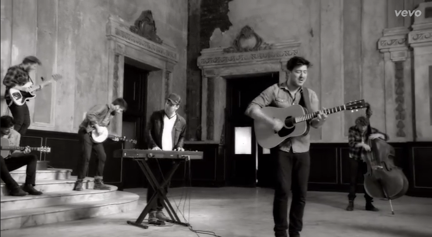
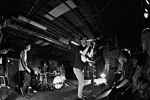
- Music videos often cut between a narrative and a performance by the band
- A dance may be added as part of the artist's performance or an addition aspect to add 'repeatability'
- Sometimes the artist (Usually the singer) will be in the performance, acting as the narrator and participant
- Lip-sync close-ups and mining of playing instruments still remain as the heart of the videos
- This assures that the band really can "kick it"

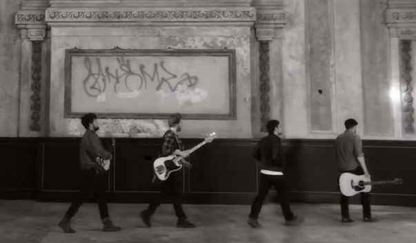
'Miserable at Best' by Mayday Parade is a good example of performance and narrative

-  The video allows audiences access to the performer on a greater level than a stage performance
- The artist can be presented in a number of ways using methods not possible in live concerts
   - Eye contact and facial gestures via the close up
   - Role playing via the narrative
   - Mise-en-scene

- The mise-en-scene may be used to create 'authenticity' (In Simon Frith's terms)
- Narrative-based videos need to establish setting and relationship to existing film or TV genres
- It can also be part of voyeuristic context by suggesting a setting with sexual allure
   - Such as a sleazy nightclub or boudoir
- John Stewart suggests it may be used to emphasise an aspirational lifestyle
   - Emphasis on latest gadgetry can crate a futuristic look

- Other commentators have divided music videos in terms of style
- There will often be crossovers between these, apart from Performance and Narrative
   - These six are common: Gothic, Animated, Dreamscapes, Portraiture, Futuristic and Home Movie


Directors Research- Shane Drake


Shane Drake    

Drake started his career by working as and cinematographer for Deftones and other such bands. He then moved onto directing and has directed over 50 music videos and co-produced three films. He now owns Red Van Pictures, a Los Angeles-based production company.

He has been nominated/ won many awards for his work, most prominently with Panic! at the Disco.

He has directed music videos for many well-known artist, from all genres. For example; Tim McGraw,  Fall Out Boy, Paramore, The Wanted, Timberland, The Plain White T's, Daughty, Three Days Grace, Avril Lavigne etc.


I like Drake's style as he takes can take the 'typical' relationship video and put an interesting twist on it. This is seen in Highway Don't Care by Tim McGraw, Smile by Avril Lavigne and Outta My Head by Daughtry. I particularly like his use of jump cuts as they fit in well with the videos/ tone of the song and they look tasteful, rather than tacky as they often do.

The use of lighting/ colour in his music videos is interesting and unique. Many of his videos are lit or colourised in unexpected ways, such as in Smile where there are black and white shots, however, red is picked out as the only colour. This makes the paper hearts stand out against the 'uncoloured world'. This is a nice look and helps highlight particular bits of the narrative. In Panic! at the Disco's Nine in the Afternoon, the lighting is very bright indoors, whereas outdoors it is very washed out. I believe this is to reflect the '70's feel of the music video and I like the way Drake achieved the look.

His use of lens flares and 'sunset' lighting gives LP's Into the Wild a very contrasting video to other more popular songs. The natural looks fits with the theme of the song and gives a nice break to other harshly lit Pop Videos. The use of lens flares creates a gorgeous look of the setting and gives the look of a soft, warm filter without really adding one.
-The use of lighting in his music videos has helped me to come up with some ideas for my own video, particularly the 'turning back the clock' feel of Nine in the Afternoon.


Also, his use of diegetic sound in the  narrative parts of the video is fairly unique and I feel it makes the music video more of a short movie than a 'song with pictures'. This is seen is many or his music video, particularly in Highway Don't Care and Whoa oh by Forever the Sickest Kids. It gives a nice aspect to the song, not often seen in music videos. It also helps with the verisimilitude of the video and captures the attention of the audience more as they get sucked in by the almost film-like feel.