Music Video
The video itself mixes live performance and a mixture of different scenes. The live performance is not in a studio, as they usually are, but is in fact in a field. This is a fairly unusual thing to do, however it works out very well as it helps to connect the performance and the additional scenes.
In the additional scenes, we see a variety of different occurrences, from people graffiting public property, interviews on TV to people placing signs in front of cameras. This all comes together, along with the music of the song, to spell out the lyrics of the song. This is a very unique way of making a lyric video but works really well, taking advantage of different situations to display the lyrics in different ways.
The shots themselves are irrelevant to the song, other than displaying the lyrics in a creative way. The performance has people surrounding the band, digging holes with shovels. Once again, this has no relevance to the song but ties in the random other shots to the song nicely.
The costumes used are casual clothing for all members, apart from those in the band. The band members are wearing semi-formal clothing that is styled to look old fashioned. This goes well with the theme of the album, the songs and of the band in general. It also help the band to stand out from the rest of the people in the video.
The lighting used throughout the performance is all ambient, from what I can tell, the field looks brightly lit up but there are no harsher spots than others, this indicates that additional spotlights may not have been used. As for the other scenes, a variety of different lighting is used. Mostly it is ambient lighting. However, at the end, a spotlight is used to shine a stencil onto the sky. This is a technique used by the Comic Book franchise 'Bat Man'. It creates a nice end to the separate scenes in the song as 'Hey Moon' is shone onto the night's sky, creating a lit up version of the lyrics on the clouds.
Magazine Advert

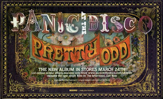
The first thing that grabs your attention about this magazine advert, it the layout of it. Whilst most adverts are portrait, Panic! At the Disco have opted for a landscape one instead. This stands out against the crowd as it is very different.
The vintage look of the poster works well with the songs on it. It also suits the band as they are often seen in vintage style wardrobes.
The use of lots of colour really captures the audiences attention as it is bright and nice to look at, however the use of multiple colours of the band name, renders it quite hard to read, therefore it may be easier to avoid doing using this idea, no matter how nice it looks. The use of white text on the colourful background also makes the information at the bottom hard to decipher.
The font used for the 'Panic At The Disco' helps to show the quirkiness of the band. The lettering looks almost like calligraphy, showing their vintage aspect, and the mismatched letter sizing makes it quirky, similar to the band itself.
The font used for the album title 'Pretty Odd' has an almost old fashioned carnival ticket look. This could be used to describe the songs in the album as they are all 'pretty odd' and some almost feel like something you may hear at an carnival.
The central artwork on the advert has a nice vintage look, that stands out among other adverts, and is the same as on the album. This may be useful marketing as if people saw the advert, but forgot the album title, they may be able to find it due to remembering the artwork. This may mean a boost in sales, even if it is small. The artwork also helps to identify the quirky genre of the band and therefore the songs in the album.
The bordering artwork also works well with the vintage theme and the gold on purple makes it stand out well. It also helps to tone down the advert, as if it was all the central artwork, the advert may be slightly overwhelming.