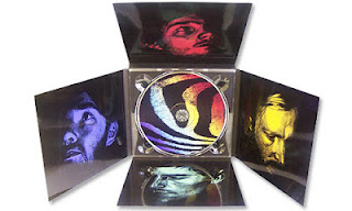
 This is the digipack for Maltese' 'Wonder'. The first thing that strikes you about this digipack is the layout of it. It is not the traditional layout for a digipak, but is instead in the shape of a cross. This works really well for the band as they have used each inner flap to display a different member of the band. This is very creative and looks nice when displayed.The use of bright colours overlaying the men's faces helps to make the pictures stand out. The shadows blending into the background helps to create an almost hand drawn, pop art effect to the photos, which is quite unique.
The use of colour in the photos gives the album a unique look and they tie in together very well, using the picture behind the CD slot to merge the colours together. It works well as the colours become more associated with one another instead of just being a way to make each face stand out. With the CD in place, the colours are still tied together as the photo on the CD uses all the different colours used on their faces.
The use of minimal writing, in plain black capitals emphasises the photos, instead of bringing your focus onto what is written. I think this helps to bring out the creativity in the photography, instead of covering it up with words and taking from the photos.
 This is the digipak for Dartmouth's 'Frequencies'. This digipak contains no actual photography therefore I would not be able to do something like this for my final digipak.
In this digipack, I particularly like the use of text. The font they used is very simple and the plain colours they used (Black and White) draw the emphasis into the artwork of the album, which helps them stand out in a more basic way. It also makes it much easier to read than other texts which use hard to read fonts or colours that make it hard to see. The text on the front cover is unique as the band has slightly lowered the opacity of the text, meaning the wave is visible through it. This gives the text an interesting texture, without making it hard to read or changing the colour of the font.
The track list is very small on this digipak, however I think that works well as if it was bigger, the positioning would be different and it would take away from the artwork on the cover.
 This album is very different in style from other one's I've looked at. The whole digipak is created to look like an old fashioned or sacred book. This fits the theme of the both the album, 'Faerie Archives' and the folk genre of the band 'High Priestess'. Although not in the genre or style that I will be doing for my digipak, this one has many quirks about it, making it unique and interesting to read and look at.