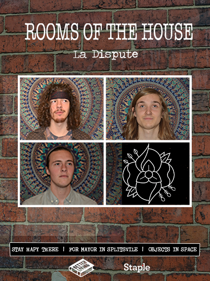
I creates a draft edit of my final digipak, however I got some critique from my audience and they suggested I should re-think the photos so the digipak has a more stylised look. They did also say that they liked the style of the digipak overall as it suits the band and ties in well with the magazine advert.

I decided to use the same brick pattern on the background of my magazine advert, to help tie the album to the advert more.
I decided on using these photos as they fit with the layout I liked, with the four photos in the middle, they also suit the style of the band as it if fairly indie/ alternative style and the wall hanging they are posed against brings out that style.
My main problem with the advert like this is the lighting in the photos is different, despite taking all the photos a the same time, in the same light.
To save re-taking the photos, I will be adjusting the brightness of them until I find one that makes all three photos of similar brightness, whilst still looking natural.
I also need to take a photo of the wall hanging on its own to go behind the La Dispute logo in the last box.
