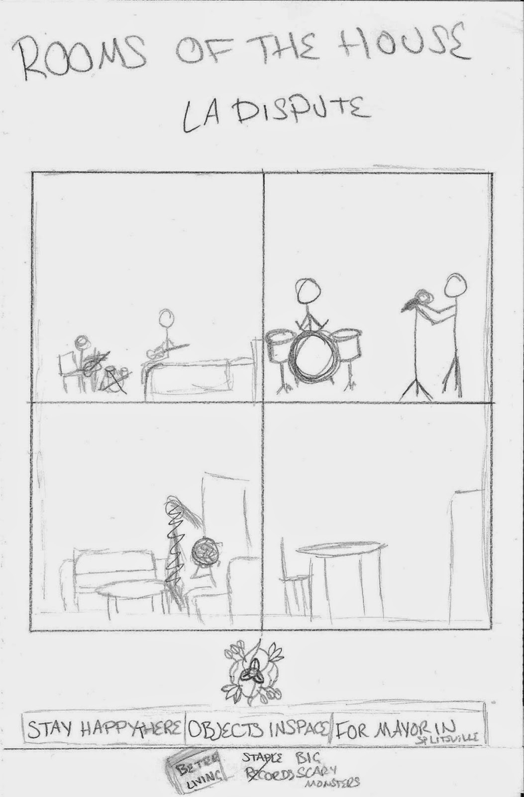
I also liked the layout of the Mumford and Sons advert, making it very easy to read and quickly get the information from. I brought this idea into my own mock up.
I haven't decided the font for the advert yet as I need to choose one that suits the pictures, therefore I left the information in plain block capitals.
The logo underneath the picture is the logo of the band themselves. although it won't add to my marks for my advert, I thought it looked nice and helped to tie the band to the album more.
The record labels at the bottom are ones the ones that the album has been released on. Most of the adverts I've seen had logos from the record label.

This is just a rough sketch of my idea and there are some bits I didn't properly remove, so I will do a more accurate mock up after I have seen the photos I will be using for it.